A gradient-boosted model with 500 trees, or a neural network with millions of weights, can be very accurate and still give you no idea how it reaches its answers. Explainable AI (often shortened to XAI) is the set of techniques for opening that box far enough to check what is going on. This post covers why that matters, the main methods, and where they mislead.
Why explanations matter
There are three practical reasons, and none of them is academic.
- Debugging. A famous failure mode: an image classifier that “detects” wolves by spotting snow in the background. Accuracy looked fine; an explanation showed it was looking at the wrong pixels. Explanations catch data leakage, such as a hospital model that learns from which scanner took the X-ray, before it ships.
- Trust. A doctor, loan officer or engineer will overrule a model they can’t question. “High risk because of two missed payments and a 46% debt-to-income ratio” is something a person can check against their own judgement.
- Regulation. Under GDPR, people subject to significant automated decisions are entitled to meaningful information about the logic involved. The EU AI Act adds transparency duties for high-risk systems such as credit scoring and hiring, and lenders in many countries must already give reasons for turning someone down.
Global vs local explanations
A global explanation describes the model’s overall behaviour: which features matter most across all predictions, and how the output moves as a feature changes. A local explanation answers a narrower question: why did this applicant get this score? The two can disagree. Income might be the most important feature overall and still be irrelevant for one particular person whose missed payments dominate everything.
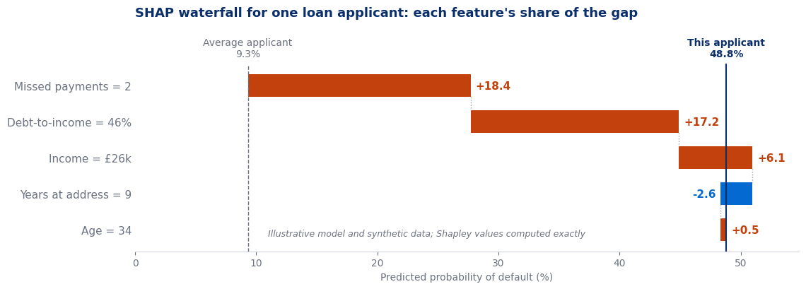
Here is what a local explanation looks like in practice, for one applicant scored by a credit model:
Some models are explainable by design. The coefficients of linear regression or the odds ratios of logistic regression are global explanations you can read off directly, and a shallow decision tree can be followed by hand. The techniques below are model-agnostic: they treat any model as a black box that takes inputs and returns outputs.
SHAP: sharing credit fairly among features
SHAP (SHapley Additive exPlanations) borrows an idea from game theory. Imagine the features as players who together produced a payout: the gap between this prediction and the average prediction. How should that payout be divided fairly? Lloyd Shapley’s answer was to add the players one at a time in every possible order, record how much each one adds when it joins, and average those contributions over all the orders.
The result has a property that makes it easy to read: the contributions always add up. In the waterfall near the top of this post, 9.3 + 18.4 + 17.2 + 6.1 − 2.6 + 0.5 = 48.9, which matches the 48.8% prediction apart from rounding. Every percentage point of the gap is assigned to exactly one feature, and no feature can claim credit it didn’t earn.
🧪 Shapley values by hand, with two features
Order A then B: A adds 30 − 10 = 20, then B adds 50 − 30 = 20.
Order B then A: B adds 20 − 10 = 10, then A adds 50 − 20 = 30.
Average over both orders: A gets (20 + 30) / 2 = 25, B gets (20 + 10) / 2 = 15. Together 25 + 15 = 40, exactly the gap. The extra 20 that appears only when A and B are both present (an interaction) is split between them.
With 5 features there are 120 orders; with 50 there are about 3 × 1064. So libraries approximate. TreeSHAP computes exact values quickly for tree models such as random forests and gradient boosting, and KernelSHAP estimates them by sampling for any model. Average the absolute SHAP values over a whole dataset and you also get a global importance ranking, so one method covers both views.
LIME: a simple model, just around one point
LIME (Local Interpretable Model-agnostic Explanations) takes a different route. To explain one prediction, it creates a few thousand slightly altered copies of that input, asks the black-box model to score them, and then fits a small linear model to those scores, giving most weight to the copies closest to the original. The linear model’s coefficients are the explanation. The logic is that any curve looks roughly straight if you zoom in far enough.
LIME is quick and works on text and images as well as tables. Its weakness is instability: the answer depends on how you perturb the input and on how “close” is defined, so two runs on the same prediction can rank features differently. Run it several times before believing it.
Partial dependence: how the output moves with one feature
A partial dependence plot (PDP) is a global tool. Pick a feature, say income. Set every row in the dataset to income = £20k, predict, and average. Repeat for £30k, £40k and so on, then plot the averages. The curve shows how the model’s output changes with income, with every other feature left as it naturally varies. Plotting one line per row instead of the average (an ICE plot) shows whether everyone responds the same way or whether the average hides groups moving in opposite directions.
Feature importance and its traps
The quickest global explanation is a feature importance chart, and it is also the easiest one to misread.
⚠️ Four ways importance charts mislead
- Built-in tree importance favours features with many distinct values. A random ID column can look important because it offers so many possible splits. Prefer permutation importance: shuffle one column and measure how much the score drops.
- Measure on held-out data. Importance computed on the training set rewards whatever the model memorised. Use the test set.
- Correlated features split or steal credit. If income and salary band carry the same information, each can look half as important as it really is, or one can take all the credit, depending on the model.
- Correlated features also break PDPs and SHAP. Both plug in combinations the data never contains, such as a £15k income with a £900k house, and report what the model does on those impossible rows.
The limits: explaining the model, not the world
This is the single most important point about explainable AI. SHAP, LIME and partial dependence all describe how the model uses its inputs. None of them tells you how the world works.
If a model gives postcode a large SHAP value, that means the model leans on postcode. It does not mean postcode causes default. Postcode may be standing in for income, or for ethnicity, which is exactly how bias in machine learning slips past a rule that says “don’t use protected attributes”. An explanation can show you that the proxy is there, but it can’t tell you whether acting on it is fair or lawful.
The same caution applies to advice. “Your risk would drop if you had lived at your address longer” is a statement about the model’s arithmetic. Moving house less often won’t make anyone a better borrower. Causal questions need causal methods, such as experiments or careful causal inference, and an explanation should never be presented as a substitute for them.
🔑 Key Takeaways
- Explainable AI supports debugging, trust and regulatory duties, and the debugging benefit alone justifies it.
- Global explanations describe the whole model; local ones explain a single prediction, and the two can disagree.
- SHAP shares the gap between a prediction and the average fairly among features, and the shares always add up.
- LIME fits a small linear model around one point; partial dependence shows how the output moves with one feature.
- Every explanation describes the model, not the world: importance is not causation, and proxies can hide bias.
Further reading
Christoph Molnar’s free book Interpretable Machine Learning covers every method here in more depth, and the SHAP documentation has worked examples of waterfall, beeswarm and dependence plots in Python.
Where to go next
- Bias in machine learning: what to check once an explanation reveals a proxy
- Gradient boosting: the kind of model SHAP is most often used on
- Decision trees: a model you can explain simply by reading it
- Start Here: the full learning path